HTML details is awesome
A while back, I read the slides and notes of a talk by Mu-An Chiou, titled “Details on <details>”. It’s a fantastic overview of how to use the <details> element of HTML.
In short, details, and its pair summary, are a way to implement native collapsible sections, without relying on Javascript. Toggling content is one of the most common actions on the web, so being able to provide that without scripts is appealing. It is not just collapsible sections though; you can make panels, menus, and other imaginative things with it!
I had stashed that knowledge at the back of my mind. Then, some weeks ago, I was implementing a collapsible section for the webmentions on this blog:
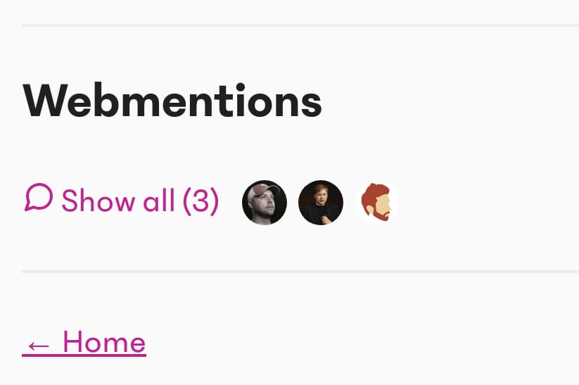
This seemed like a great use case for details. I would get the native functionality of toggling, and could then work with styling it. Let’s go over how to implement it.
Markup
You nest <summary> inside of <details>. <summary> is what appears as the “toggle button”, regardless of the section being collapsed or not. Anything after that will be hidden and only appear when the widget is open.
Here is what an initial attempt at our comments section would look like:
<details>
  <summary> Show all (2) </summary>
  <ol>
    <li>I am a comment</li>
    <li>I am another comment.</li>
  </ol>
</details>
Styling
There are a couple of extra things to know about styling details.
The arrow is styled with the list-style properties on summary, except in Chrome, which uses ::-webkit-details-marker. You could consider resetting them and then relying on a unified ::before selector.
The open attribute is added when the summary is open. You can query that as details[open] to style the container further. The demo on MDN shows the open attribute in practice.
I also found that on Safari, the summary element cannot be a flexbox container, even if defined in CSS. I wanted to do that to show author images next to the “Show all” text. I added an extra div wrapper inside of summary, to act as the flexbox container.
After adding some more styles to our details, it can look like this:
<details class="details-reset">
  <summary class="summary fg-highlight cursor-default">
    <div class="flex-wrapper-for-safari">
      <span>Show all (2)</span>
      <div class="author-list">
        <div class="author">
          <img
            src="https://fotis.xyz/img/logo.png"
            alt=""
            class="author-image"
          />
        </div>
        <div class="author">
          <img
            src="https://fotis.xyz/img/logo.png"
            alt=""
            class="author-image"
          />
        </div>
      </div>
    </div>
  </summary>

  <ol>
    <li>I am a comment</li>
    <li>I am another comment</li>
  </ol>
</details>:root {
--highlight: #da0993;
}
/* Styles and resets for the <details> element.
* @see <https://github.com/primer/primer/blob/master/modules/primer-buttons/lib/button.scss#L206-L213>
*/
/* Remove marker added by the display: list-item browser default */
.details-reset > summary {
list-style: none;
}
/* Remove marker added by details polyfill */
.details-reset > summary::before {
display: none;
}
/* Remove marker added by Chrome*/
.details-reset > summary::-webkit-details-marker {
display: none;
}
/* Other styles */
.flex-wrapper-for-safari {
display: flex;
align-items: center;
}
.fg-highlight {
color: var(--highlight);
}
.cursor-default {
cursor: default;
}
.author-list {
display: flex;
margin: 1rem;
}
.author {
width: 2rem;
height: 2rem;
}
.author-image {
max-width: 100%;
border-radius: 100%;
background-color: gray;
}Focus affordances
In reality, our section summary has two distinct elements; the “show all” button, and the profile pictures of commenters. The whole summary is interactable as far as input methods and highlighting are concerned. This makes sense to start with, and is a benefit of using semantic HTML.
I think we can do a bit better, by enhancing the focus, so that it highlights the action more clearly. If the user focuses (by keyboard or otherwise) on the section, I would like to only highlight the “show all” part. This “nested focus” pattern is something I took out of Heydon Pickering’s “Collapsible Sections” article.
<details class="details-reset">
  <summary class="nested-focus fg-highlight cursor-default">
    <div class="flex-wrapper-for-safari">
      <span class="nested-focus-target">Show all (2)</span>
      <div class="author-list">
        <div class="author">
          <img
            src="https://fotis.xyz/img/logo.png"
            alt=""
            class="author-image"
          />
        </div>
        <div class="author">
          <img
            src="https://fotis.xyz/img/logo.png"
            alt=""
            class="author-image"
          />
        </div>
      </div>
    </div>
  </summary>

  <ol>
    <li>I am a comment</li>
    <li>I am another comment</li>
  </ol>
</details>:root {
--highlight: #da0993;
}
.nested-focus:focus {
/* NOTE: The only good reason to hide an outline is if you enhance it */
outline: none;
}
.nested-focus:focus .nested-focus-target {
outline: 2px solid var(--highlight);
}
/* These are the same as above */
/*
* Styles and resets for the <details> element.
* @see <https://github.com/primer/primer/blob/master/modules/primer-buttons/lib/button.scss#L206-L213>
*/
/* Remove marker added by the display: list-item browser default */
.details-reset > summary {
list-style: none;
}
/* Remove marker added by details polyfill */
.details-reset > summary::before {
display: none;
}
/* Remove marker added by Chrome */
.details-reset > summary::-webkit-details-marker {
display: none;
}
/* Other styles */
.flex-wrapper-for-safari {
display: flex;
align-items: center;
}
.fg-highlight {
color: var(--highlight);
}
.cursor-default {
cursor: default;
}
.author-list {
display: flex;
margin: 1rem;
}
.author {
width: 2rem;
height: 2rem;
}
.author-image {
max-width: 100%;
border-radius: 100%;
background-color: gray;
}Other things to consider would be user-select and cursor. user-select in particular is an open question, so I left it intact. I did give the summary a cursor: default, though there are certainly different ways to prioritise.
The polyfill for details is great. It is small in size (just under 1.5kB), and covers IE and Edge well. It is also a good example of a layered polyfill, where parts of the functionality are polyfilled depending on what is supported. Give the source code a read, I learned a bunch from it.
Scott O’Hara investigated the use of the details element with various screen reader and browser combinations. I would urge you to read that piece for more information and readouts. A summary would be that screen reader support is good, with a few edge cases pending.
(I would love to fill more on this after looking into it myself, and checking the status of the bugs mentioned by Scott).
Apart from Scott’s notes, there are a couple of things I would point out for collapsible sections.
Avoid changing the display text
You might notice in the example above that I avoided changing the “Show all” text when expanding. You could do this with Javascript, or even some CSS conditional on the open attribute. Beware though! In toggle buttons, it is common to not change the text, since the state is already communicated via aria-expanded (Heydon Pickering writes about toggle buttons). I think collapsible sections with the details element should follow the same idea, since the state is communicated natively.
If I did want to change the display text, I would try to always expose the same text to screen readers, and keep parity with toggle buttons.
<details>
  <summary>
    <!-- This is exposed to assistive technologies -->
    <span class="visually-hidden">Show all (2)</span>
    <!-- These will be hidden from assistive technologies -->
    <span aria-hidden="true" class="summary-open">Hide all</span>
    <span aria-hidden="true" class="summary-closed">Show all (2)</span>
  </summary>
  <ul>
    <li>I am a comment</li>
    <li>I am another comment.</li>
  </ul>
</details>
/* Hide visually, but keep in the tree for AT */
.visually-hidden {
position: absolute !important;
height: 1px;
width: 1px;
overflow: hidden;
clip: rect(1px 1px 1px 1px);
clip: rect(1px, 1px, 1px, 1px);
}
details .summary-open {
display: none;
}
details[open] .summary-open {
display: inline;
}
details .summary-closed {
display: inline;
}
details[open] .summary-closed {
display: none;
}However, keeping the rules of ARIA usage in mind, and gauging the value of this feature, I would not implement it. It is not a big deal if “Show all” persists visually, and I like that the presentation is unified. Also, the arrow is a good indicator already, so if you need this feature, then consider not removing it.
Avoid interactive content in summary
Interactive content in summary is an open question on the spec. I also would question the need for that. I would not place, say, a button inside a button, and in the same spirit I would not nest something interactive inside summary. Your mileage may vary, and it might be a chance to rework the widget, if you have this use case.
The details element is a great part of HTML. It offers a lot of commonplace functionality without relying on JS. This is important when it comes to resilience. Between requests failing, or a heavy load on the browser (such as when hydrating server-rendered markup), being able to collapse sections without relying on main scripts is valuable.
There are even more interesting uses of details by Github, such as modals and menus. It has a couple styling hooks of its own, and even some UX questions to explore. The polyfill is well-encompassing, and the accessibility story pretty solid.
Have you tried using the details element in your projects? How did you find it? Let me know!
- Mu-An’s presentation and notes that set me on this path. It offers a concise explanation and guidance, perfect for bookmarking and referring to, say, when writing an article :)
- The MDN guide on details has a good summary (no pun intended)
- The spec for details
- The polyfill for details
- Heydon Pickering’s Inclusive Components has a chapter that explains the various affordances that Collapsible Sections provide. He also goes into details about how to implement one with Javascript. Give it a read, it is good stuff.