Keeping Sites Accessible with Types
This is an enhanced transcript for a talk I gave at ClojuTre 2019. I have included relevant graphics and code snippets. Clicking on the timestamps in the transcript will play the video at that specific time.
Accessibility on the web takes effort. The responsibility is split amongst development, design, and really anything that touches the product. On development and design, many of the common issues (color contrast, semantic markup and forms) have known practices and patterns.
However, there is a problem: HTML is permissive of anything and the semantic patterns often require expertise and research. On a bad day, or a tight deadline, even the most diligent person can miss things.
The rise of typed functional languages on the frontend affords us an opportunity. We have a chance to encode the values of accessibility in our system, in a way that our coworkers and future selves can avoid these issues automatically, as well as learn about them in a practical way.
In this talk, I will give a brief introduction to web accessibility, as well as concrete examples that help preserve it in our codebases. After the talk, I hope you’ll have issues for your backlog, as well as the confidence to tackle them!
Slides
You can find the full set of slides and resources on Notist.
Transcript
Hello, hope you've all enjoyed dinner by now. Hope the food coma is not too bad. If it is, it's fine. I can live with that. Be happy.
I'm Fotis Papadogeorgopoulos. As was said earlier, I come from Greece. I live here in Finland just so I can talk at Clojutre 2019, or not really, but ... And I work at Futurice and I'm here to talk to you about accessibility and in particular, keeping sites accessible with types. But one of the first things I would like to understand first before this talk is how many of you work on the front end, like in a website on the front end? Okay, that's a good ... Whoa, that's a bigger number than I thought. That's great. And how many of you know about accessibility? Ooh, still a big number of people. I'm very positively surprised. Cool.
One of the things that I want to make clear to you today is accessibility is a very large topic, and I'm not going to be covering all of it. In particular the thing I'm going to be talking to you about is the thing that I have struggled a lot within the last two years, which is keeping sites accessible. Making sites accessible I think definitely takes effort, especially earlier on in a project's life cycle than later on, but the question I've been asking myself quite often is how can we keep websites accessible with limited accessibility expertise available and with large numbers of people working on the web today.
The way I have found that to be good is with types, but there can also be other solutions. So please, I understand there's different ways to solve this problem, it's fine. This works for me and the teams I work with. So I'm going to talk to you a little bit briefly about accessibility on the web. Accessibility on the web is a lot about communicating information to users essentially. For a lot of users, this is with visuals. You see a button, you're like, "Ah, that's a button." Hopefully it's styled like a button, and you can use it, but for a lot of users they have to rely on assistive technologies, which is special pieces of software that read the structure of the document. And they are able to present that information in a usable way.
For example, commonly we say that we're trying to communicate a name, a role, and some sort of value for an interactive widget on the screen, and not everything on the screen is necessarily interesting, like empty divs are not really interesting, but buttons probably are. So if we had a button that said, "Book tickets" and then with a screen reader, which is again, a piece of assistive technology that reads out the content of the page, it would say, "Book tickets, button." "And by the way, since it's a button, you can press Enter or Space to activate that". There's a sort of contract going on there.
If you want to learn a little bit about more the details, and I apologize, this slide, you should probably look at it right to left. You have a new web document, you have the button as the markup. The browser knows to parse that into the name and the role, and that's because you have the default HTML button, which then the operating system has different APIs and the screen readers and assistive technologies interface with that. So they see that, oh hey, I've got a button whose name is Foo. I know what to tell the user to do with that.
There's a fantastic article by Melanie Richards on A List Apart called Semantics to Screen Readers that covers that. So if that sort of thing interests you, I would highly recommend that you read it. And commonly, with accessibility, we have a sort of cake or a pyramid or whatever you want to call it. If we're talking about exposing the roles and the names and the values to people, then there are sort of these layers of how you can achieve that. So HTML plays a very important role there because a lot of the default and built-in HTML elements, they expose a lot of these things correctly. So buttons, they're operable by clicking or with Enter and Space keys. And commonly when people implement those in JavaScript or in some custom behavior, they forget to handle Enter or Space or both of them sometimes, and that's something that the default button gives you by default.
CSS also has a role to play. Of course it's nice if buttons well, look like buttons, and this sort of styling you do on the web is with that. JavaScript also has a role to play in accessibility. Quite often a negative role if implementing custom things without considering how the semantics get exposed, but very often it does have a good role because a lot of the things that have to do with state, right? Like how the DOM changes. Like an aria-expanded of true or false for a collapsible section, you're going to need JavaScript to do that. You could probably do some weird CSS hack but not recommended because again, you're not exposing the roles and the values to people.
And for all of these I'm saying it's the HTML and CSS and JavaScript. In fact, the code examples I'll show you today are in Elm because this is what all of these things end up in the browser no matter how you end up doing it. Still that, and I would wait or even when WebAssembly had host bindings, they would still be working pretty closely like that. And finally we have ARIA, which stands for Accessible Rich Internet Applications. You might've seen those as attributes on HTML quite often and a lot of people tend to think that accessibility is ARIA. It's not. ARIA is a specific set of markup that fills in holes in a way in HTML. HTML currently, maybe in the future it will cover more of these things, but there are certain states and roles that HTML by default does not provide, and it's for those cases that using ARIA is a really good idea because then you can communicate more useful things to users. And you'll see even later on that we don't have actually much ARIA use in these examples.
So what are some common issues in accessibility? The issues I'm going to tell you are really, really common, and for many accessibility practitioners, not super interesting. However, they're common and they do affect users concretely, and I think it's important that we are able to address these common, and I would say simple in many ways issues, such that people have concretely a better experience right now.
So one of the things that is very important is heading order. We all know headings in HTML H1 to H6, they're supposed to be nested consistently and if you were to remove them, you should be still be able to get an understandable outline of the document. So if you think of headings in HTML as giving you the table of contents, that is kind of how they're supposed to do that, and the reason is that ... Well, for sighted users it helps to navigate and orient themselves, but also for assistive technology users, there are many modes that can navigate by headings, that can jump to headings, which really helps when you have complex websites. It's very, very important.
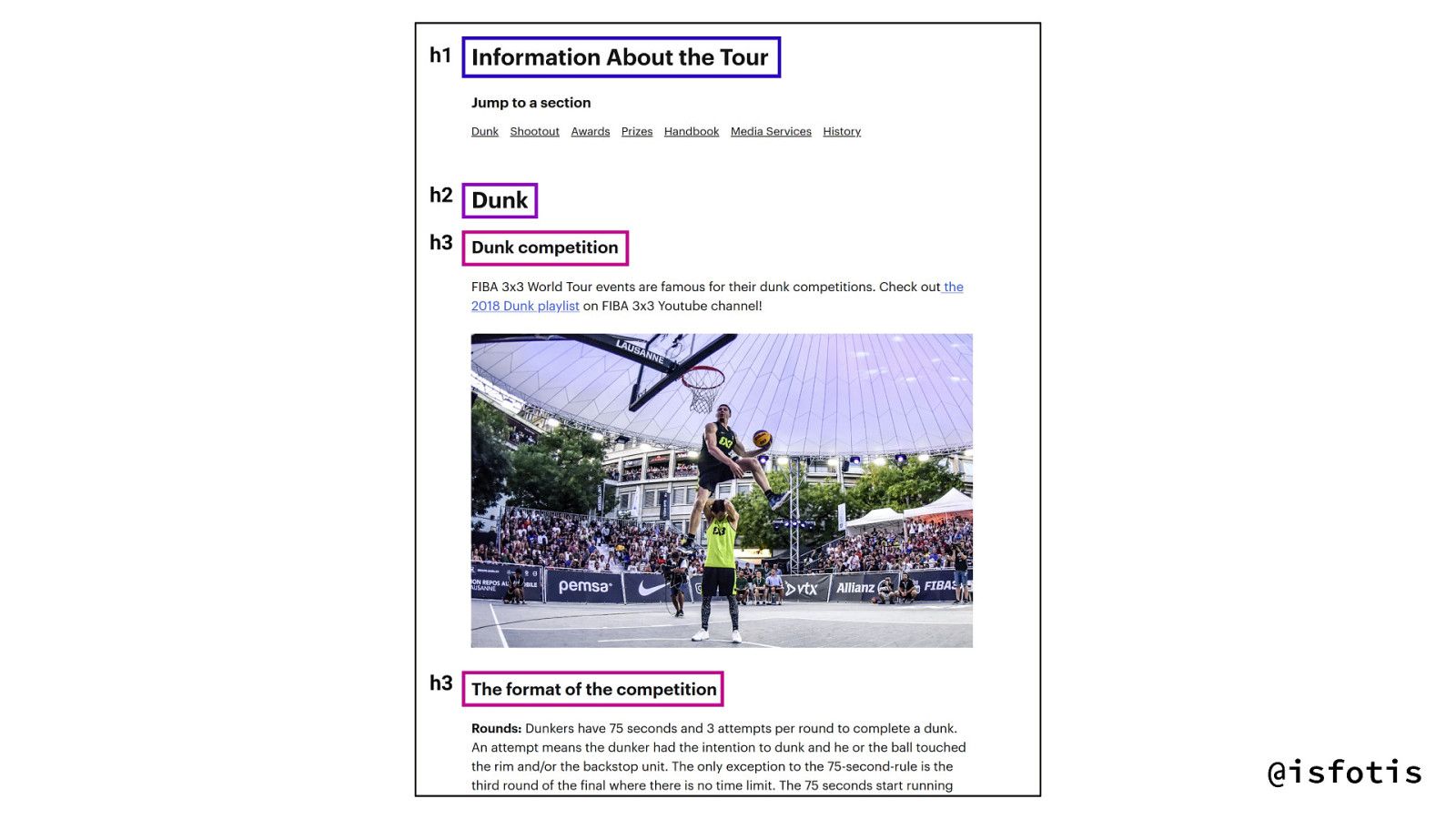
So you see this example on this basketball site I've worked on have a heading one of information about the tour, heading two, there's a sort of dance competition, and heading three is more details about that. What should not happen in the picture that you're seeing right now is jumping from H1 to H4 because that is quite confusing and it kind of makes the document outline a bit nonsensical. Like you would not see it as something valid to jump to if it was in H4 maybe. It doesn't destroy it, but again, it can be really confusing when you look at the table of contents and it's jumbled, right?
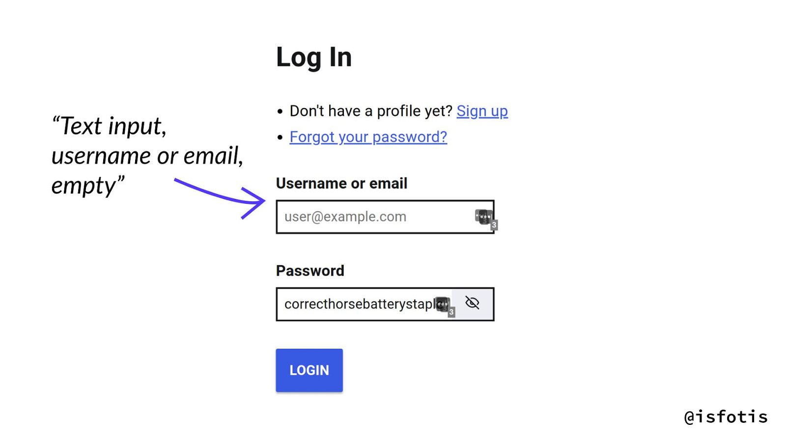
The second thing that I've got to talk to you about is form labels. Form labels again, the text above the form. They provide visual guidance to sighted people and also to assistive technology users, labels bestow an accessible name to the inputs. So for example, if I were to focus this input field up there, it would say, "Text input, username, or e-mail," which has the name bestowed by the label, and by the way, it's empty. You haven't put anything into it. It's probably going to tell me also some focus and form controls that we don't need to worry about right now.
That's not the only reason to have labels, by the way. You can imagine for even sighted users if you have to book flight tickets and flight tickets are expensive or I don't know, flight tickets back home for me are expensive, and you get stressed and because there are no labels, you don't know if you're filling in your first name or your last name. If you get that wrong and you need a passport to go to a country, that can cost you a lot of money, to save time and so on. So labels have a really important role to play for everyone, not just assistive technologies. It's not just to be proper.
Also another fun benefit of that, if you label things correctly, password managers can pick up on things, which again can improve fill rates and stuff. And yet, more than 50% of the homepages on the web don't have labels, like 50%. Now I don't believe that 50% of home pages on the web set out to make an inaccessible website, or at least I choose to believe that or hope to believe that, but I can understand deeply how it happens, right? I can empathize with this idea that it's on a tight deadline or maybe the design wanted something or maybe the developers forgot or any of those ideas. No, maybe the label ids were wrong. So it's common and it's important.
The third thing I'll talk to you about is missing the image alternative texts. Now alternative text is a sort of description that you can give to images if they are content. So if an image is content, you can describe this image and if an image is decorative, you should empty out the alt text so that it's not. What should not happen is that the alt text is missing. If the all text is missing, commonly it's a bit of a defined behavior. In a screen reader, you will hear the name of the image so you'll hear ABCDEF13.jpeg. That means nothing.
Actually, it's funny because it means less than nothing because it ... You're not sure if at that point it's an image that's content and you're missing out on it or it's just taking up head space. So less than nothing, you heard it here first. And yeah, missing image alt text, 68% of homepages of the web don't have it, and again, right? This thing, image alt text is very context dependent. You might have a picture of a dog and if you're on a camping website it's probably decorative and you can skip it, but it might be a site about dogs, in which case, describe that cute dog. So they're very context dependent and that's why I can sort of understand ... Well, I don't know if 68% but the high rates of missing image alt text.
And anyway, on a bad day or a tight deadline, even the most diligent person will get things wrong. Of course all of us ... None of us wake up in the morning and say, "I'm going to go and write some inaccessible sites." I hope we don't. I mean maybe, I don't know. You do you, but the thing is that we've all had days when we're tired, when we're down, days when a PO is breathing down their necks and they're like, "I need this done by yesterday." It happens and in those cases, when it happens, that is where I found types to be really useful. I find types really, really useful to encode these essential human values in the system, right? To say we care a lot about accessibility in these concrete cases and thus we're going to make sure that something of the type level is going to stop you from doing the wrong thing essentially. So we're offloading something of that to the computer.
I'll give you some concrete examples again in Elm and I would also recommend that you don't focus too much on the examples. I would like you to take the idea away from this. There's many different APIs and ways you could do this and I understand that you might have different preferences than others. So having said that, heading level, we can make a custom type, heading one to six, and then we can have some hX function that basically recreates the HTML headings.
hX : HeadingLevel -> List (Attribute msg) -> List (Html msg) -> Html msg hX level = case level of H1 -> h1 H2 -> h2 H3 -> h3 H4 -> h4 H5 -> h5 H6 -> h6That's not very interesting by itself, however, we might have more styled headings and subheadings in our system. Maybe we have a certain design that is hopefully consistent through our site and in that case you can take these headings and keep propagating this heading level, right? Like these headings and subheadings, they're styled in a certain way and they also have a specific level. Ideally you would be tying the styling to it as well, but I don't know, in projects I've worked on, we haven't had that time of bliss yet. So your mileage may vary.
heading : HeadingLevel -> List (Attribute msg) -> List (Html msg) -> Html msg heading level attrs children = hX level (class "myHeading" :: attrs) children subHeading : HeadingLevel -> List (Attribute msg) -> List (Html msg) -> Html msg subHeading level attrs children = hX level (class "mySubHeading" :: attrs) childrenWhere it really gets interesting is when you have reusable functions, components, views, whatever you want to call them, that have nested sections within them, right? Imagine you have something that can display different data, then it really helps to say that this nested section has other headings inside of it and the other only way you can know what's the correct heading level for the nesting is to know the heading level at the top. So if you have this heading level in your system, then you can do the math and figure it out sort of automatically, and then when somebody goes to use this nested section, and I have to say I love Elm type errors, it's just going to tell you hey, you tried to give me an attribute, you got ahead of yourself and started giving me styles or something, but I need you to tell me the heading level first, and that's fantastic. That's catching an error right at the beginning.
view : Model -> Html () view model = div [] heading H1 [][ text "heading demo" ] , nestedSection H2 "Hello" ] nestedSection : HeadingLevel -> String -> Html msg nestedSection level demoData = div [] subHeading level [][ text "data" ] , p [][ text "this is a section about data." ] -- Propagate the heading level + 1 , subHeading (incrementLevel level) [][ text "count" ] , p [][ text demodata ] ]Again, you can imagine that it's not just you being tired, maybe somebody just joined the project, right? And they run into this oh, heading level. It's a first, last value in this system. It means that it's important. It's a very clear signifier, reading the code that we care about this. Second thing I'll show you and here definitely, I'm convinced there is enough ways to have a form on a page as there are sites out there, so please take the APIs with a grain of salt.
There are two ways to ... Or five ways. I'm going to show you two ways of associating an input with a label. The first one is to put the label texts inside of the ... The input inside of the label element itself. That automatically bestows the name. The second way would be to associate it by a DOM ID, just a string basically, and to have the for attribute on the label, so it's the label for something. Again, we can do the same thing given input label method type, that is either embedded labeled with a string or labeled by ID with some custom type of DOM ID. And then when you create these inputs and we were talking about sort of mid level inputs, we're not necessarily talking about the input that the person is going to use every time, but something that you will use as a fundamental building block in your application.
      type InputLabelMethod
      -- Label contains the input + text
      = EmbeddedLabel String
      --Label is associated with a DOM id
      | LabelledById DomId

      type DomId = DomId String

      domIdToString (DomId idRef) = idRef
-- Creating an input input : InputLabelMethod -> List (Attribute msg) -> List (Html msg) -> Html msg input labelMethod attrs children = case labelMethod of EmbeddedLabel labelText -> label [][ text labeltext , html.input attrs children ] LabelledById (DomId idRef) -> Html.input (id idRef :: attrs) children inputLabel : DomId -> List (Attribute msg) -> List (Html msg) -> Html msg inputLabel idRef attrs children = label (for (domIdToString idRef) :: attrs) childrenThen having these input methods, you can match and do the actual DOM stuff. So in the first case you see embed label label text, we put the text inside of the label and we're done, and for more complex cases, which it can happen if you're going to style radio buttons and stuff like that, you can do a lot of nice tricks with associating labels like these or you can use the label by ID. You can have an input label and sure enough, in actual use case, you'll see in the first case I have an e-mail with an embedded label and the second case I have the labeled separately. I give it a DOM ID that I have constructed and again, many different ways to do this. It text is "name" and then I have the input which I'm declaring that it's labeled by a name label ID.
-- In use nameLabelId = DomId "nameLabel" view : Model -> Html () view model = div [] input (EmbeddedLabel "Email") [ attribute "type" "email" ][] , inputLabel nameLabelId [][text "name"] , input (LabelledById nameLabelId) [ attribute "type" "text" ][] ]This again, will give you type errors if you try to have labels without IDs or without accessible names essentially. This is something that actually ... A variation of this happened to me one day that a co-worker said, "Hey, I have this error about labels. What do I do? What is this weird input label method? I never saw that before." But that to me is a really good opportunity because then it's like oh, embedded labels might be simpler. Oh by the way, we also have more higher level functions like e-mail input, flat number input, stuff like that, that really you don't need to think about adding the labels, so maybe you can use one of these. And in any case, we're human beings, let's look at it together.
I can't stress to you how important I think this is, just this idea that says that we care about these labels in this code base and it's perfectly fine not to know how to do it or what its role is. It's something that we, in our code ... Leaving the code base, you've left behind something important about the people who will use it.
The final example I will show you is the image. So for images you can say that you have a purpose, a decorative or content. If it's decorative, you will see that I actually empty out the HTML alt attribute. It's very different. Empty string on alt is very different than not having out. Not having alt is the undefined behavior I told you about the name of the image. Having an empty alt says this is decorative. Kind of annoying, but hey, that's why we have an image component in our application that takes care of it, and like the person who uses an image doesn't have to know these things, which is great in a way. If they're curious, they can always look at the code and hopefully we've left comments to talk about that.
      type Purpose
        = Decorative
        | Content String

      img : Purpose -> List (Attribute msg) -> Html msg
      img purpose attrs =
      case purpose of
        Decorative ->
          Html.img
            ((alt "") :: attrs) []
        Content description ->
            Html.img
              ((alt description) :: attrs) []
view = div [] -- Ok img Decorative [ src "/kitten.jpg" ] , img (Content "The top of some colored buildings lit by sunset.") [ src "/sunset.jpg" ] , -- Error! Expected "Purpose" img [ src "/error.jpg" ] ]And yes, in actual use case, initially have an image that's just a kitten and it's decorative. In the second case I have, you know the tops of colored buildings lit by sunset, which is probably some photo I have taken. And in the third case, I have an error, which again, loving Elm type errors will very nicely tell me hey, you again tried to give me attributes and you didn't tell me what my purpose is, which is exactly the thing I worry about when I go to sleep at night.

So yes, what is my purpose? And again, similar discussions with people, what does this purpose thing mean for images in the system? You can have a nice discussion about it and I think images are especially important because images are so content sensitive ... Context sensitive, sorry. You can have SVG images which are commonly in buttons and then sometimes you have texts and sometimes you don't, and if you don't have texts, they should bestow an accessible name. If you have texts, you don't need it. Stuff like that. Very context sensitive, so having this wake up call whenever you try to use it I think is really, really important.
Again, you can see similar things for SVG images. Fun fact about SVG images, there are way more ways of giving them accessible names than these, like SVG is kind of HTML adjacent in that. The way I'm doing it right now is by setting ARIA hidden and ARIA label, which I think is the only use of ARIA in these demos. ARIA hidden says, "Disregard this whole thing." ARIA label says, "Hey, here's an accessible name for you." Pretty much.
There's different ways to do that and I have some references at the end by Sara Soueidan and Scott O'Hara that have written about that, but you will notice that the interface is the same, right? If you take a purpose and you get some sort of icon, so fundamentally whether you want to include a ... That's how you create a home icon let's say, but fundamentally if you want to include an image as a source or an image as an SVG, you have the same kind of conditioning about how to think about it in the system.
-- Creating a reusable image/icon homeIcon : Purpose -> List (Attribute msg) -> Html msg homeIcon purpose attrs = svgImg purpose attrs [ polyline [ points "21 8 21 21 3 21 3 8" ][] , rect [ x "1", y "3", width "22", height "5" ][] , line [ x1 "10", y1 "12", x2 "14", y2 "12" ][] ]So again, you'll see here I might have a home icon and standalone content of "home" because there's no other texts. In the second example, I actually have the text of "home" so I can just say that the image is decorative. It really doesn't do anything. You probably don't want to announce "home home" to screen readers users, maybe not the end of the world, but you know.
-- In use view model = nav [] [ a [href "/"] [homeIcon (Content "Home") []], a [href "/entries"] [ homeIcon Decorative [], text "Home" ] ]Oh yeah, TypeScript. Another fun fact is ... I don't even know this code compiles properly, but I do use TypeScript quite a lot in my day to day work and in TypeScript and React. You can have SVG images and code directly as components basically and there you can do something similar. Again, if the Elm version had four ways to do it, this probably has ten ways of doing it, so please use your favorite way of doing it, but fundamentally it's the same thing, right? That whenever you try to include an SVG in the system, you get this heads up that hey, tell me what my purpose is.
type Purpose = | {type: 'decorative'} | {type: 'standalone', label: string} const Decorative = (): Purpose => ({type: 'decorative'}); const Standalone = (label: string): Purpose => ({type: 'standalone', label}); interface IconProps extends SVGAttributes<SVGElement> { purpose: Purpose; color?: string; size?: string | number; }You might be thinking that the next few slides would be really going down into this idea of using these types to solve accessibility issues, and don't get me wrong, there's a lot of more interesting problems that you can solve with types and accessibility, but I don't want to go down that way today. Not just because we're kind of at a Clojure conference, but I think there's something more interesting to talk about here.
In accessibility, I think there is a lot of expertise that is sometimes visible and appreciated, but very, very often it's not, it's not visible. So much of the work is in the markup. Like we were building these really elaborate tables last year and we tried so hard to make them accessible. They were sortable, flippable, and so on. Showed them to the client, they told me, "Hey, this looks good." Which is fair, like that's the measure by which we judge things in a way, so it doesn't surprise me in a way that much of the accessibility work that goes on isn't visible. And we're talking about people testing with screen readers and compatibility who's much like we have actual browser testing and so on.
I think types can help ask the right questions. When in a team setting, I don't think it's ... Or I mean, I haven't found it useful to have a situation where you have a team of eight people, like I have at work, to have Fotis in the corner doing the accessibility. Maybe that will help the site concretely when you're building it, but I really don't believe that it's going to stay accessible and importantly enough, I think there's a way better way to do that. If you have the types such that somebody runs into these, like you as the person who knows about accessibility or something can encode these values in the system, and then when people run into these problems, they can come and find you and can have a much more useful discussion out of it because you're not discussing in the abstract anymore, you're talking about that thing on that page that they tried to put in.
I found it a really good way, like I genuinely feel so happy when I go to work these days and I hear people talking about labels and buttons without me having to intervene. It's fantastic. I think types then in that situation help make the work visible. There are different ways to do it. Again, I'm sure you could probably do it with good API design and not types or something like that, but regardless of what you choose, I think they really help bring this work into the light and bring up these considerations in people's minds. So much of these work, like this high percentages I showed, right? They're not people getting up in the morning to write bad code, they're people who might not know about it, who might have a tight deadline and so on, and thus, helping people build an intuition about this thing is how I'm pretty convinced is a good way to go about solving this.
I have some references.Tessa Kelly, I would be remiss to go through this talk and not mention her. She has made an accessible HTML package in Elm, which is really fantastic. If you've tried to test accessibility, you might know that it's quite hard and you can only catch like 30% of the errors. This is the best thing I have found. You literally change the imports from the default HTML to accessible HTML and you get type errors and because it's Elm, you fix the things and it works and I love it. It's such a good library and also conceptually as an idea and exploration. So if you're wondering what else you could do with types and accessibility, that might be something to check.
Sara Soueidan and Scott O'Hara, they had a pair of articles talking a lot about context and ways of marking up things and so on. Really in depth, both of them. I think you should check them out. As for me, that has been my talk. Thank you very much.
One question.
Person ...
Thank you for your talk. It was interesting. If you have a tight deadline, I mean, would your colleagues find ways to work around these types? Like parse content with an empty string or something?
Sure. Yes, they could. I would hope they would not. And again, we're talking about ... It depends on when you do this, right? If you do this a day before the deadline, you have the types, eh, maybe not, you're right. But I mean, if you have it, even for a short period I would say, it doesn't take too long until people build an intuition about it in a way. So yeah, I mean, maybe not add them the day before, I would say. But no, on a tight deadline, I think fixing this takes nothing, you know? Asking yourself whether this image is content or not doesn't take that much in the long scheme of things. It's probably faster than forgetting about it and having to fix it later, in a way.
So yeah, I think in practice, for me, has been quite okay and yeah, depending on the language that you use, it might be easier or harder to see the types, but again, I question whether people would really do that. That hasn't been my experience anyway.
Okay. Thanks Fotis.
Cool.
