An Open Accessibility Audit of “Helsinki as a Service”
Helsinki recently launched the City as a Service campaign. This post explores how to make it more accessible.
Table of Contents
Helsinki, and the tech industry in it, wishes to attract more workers. One of the recent ways they set to achieve that, is the City as a Service initiative. Its website has a video, various quotes and visuals, as well as a list of partners.
The site outlines some of the best parts of living in Helsinki. I find the techy marketing a bit much (“as a service”…), but I can understand how the content is a condensed summary of why someone would immigrate here. I did, after all, immigrate here as well, didn’t I?
One of the things that struck me, when browsing the site, is that much of its main content is inaccessible. The images were missing descriptions, the buttons lacked labels, the video modal was out of reach, and the carousel did not have any keyboard-accessible controls.
That hit close to home. When a friend shared the site with me, my initial reaction was to outline the issues with it in our chat. While that was good, and got some local support from others, I realised that nothing meaningful would happen if I left it there. That is when I got the idea to make an “open accessibility audit” for it. I hope to outline the issues, provide reference solutions, and add my voice of support for these issues.
I have seen many initiatives over the past years, that celebrate inclusivity on the surface, only to skip making their sites accessible. That seems like a contradiction to me.
If Helsinki wants to lure tech talent here, then a more accessible website can only facilitate that goal. I believe that we need more perspectives in tech, especially when it comes to accessibility. In an increasingly digitalised society, having inaccessible services can actively exclude people from participating. Most often, the people that shape those services are not solely those who write a specific piece of code, but also the people that are around to question, challenge, and shed light on otherwise invisible potential or risks.
In other words, we need more disabled people to help shape services. If a site that is meant to invite people is inaccessible, then we (collectively, as an industry and members of society) miss doubly on our goals.
We’ll be going through some of the common issues that hinder the accessibility of the site. Note that this list is not exhaustive, and it is mostly from a markup point of view.
I am a sighted user, often navigating by keyboard (wanting to get ahead of RSI), but other than that most of the audit revolves around standards and common issues in accessibility. People whose lived experiences differ to mine will have different topics on this list; that is perfectly valid, and I would urge you to listen to them.
Many of images on the site lack alternative textual descriptions, so-called “alt-text”. Assistive Technologies (ATs), such as Screen Readers, read the alt text out loud. This helps users of those technologies to make sense of the page.
If images lack alt text (i.e. the alt attribute is missing on the img), then typically the full name of the image gets read out. This is usually meaningless, of the form “abcd1234.jpg”.
This can be frustrating for a few reasons:
- It is very verbose, and adds noise if the image is decorative;
- People miss out on images that form content;
- Textual alternatives can help convey the meaning and feeling of the page, in an comparable experience to people who see the images;
- Finally, if all images are nonsensical, it can be frustrating not to know whether you are missing out on something!
In general, then, an image should:
- If it is content, have an alt text describing it;
- If it is decorative, have an empty alt text (
alt=""), so Assistive Technologies (ATs) know to skip them.
Image examples
The Companies section has logos. Those lack alt text, meaning that AT users have to guess at the names.
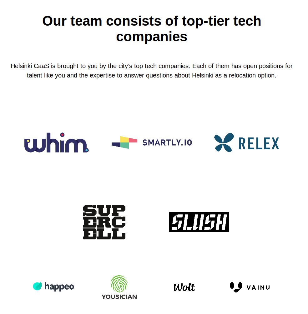
For example, this is markup for the whim logo:
<a
  _ngcontent-serverapp-c12=""
  class="logo-container ng-star-inserted"
  target="_blank"
  href="https://whimapp.com/jobs/"
>
  <lib-image
    _ngcontent-serverapp-c12=""
    _nghost-serverapp-c16=""
    style="--fit:cover;"
  >
    <img
      src="//images.ctfassets.net/cegx92j6q58r/2DGqEVRojpxcWSBpxussyl/1b839550e0fc247a2096aa1859896d61/whim_logo.png"
      class="ng-star-inserted"
    />
  </lib-image>
</a>
This is a transcript of what it sounds like with a Screen Reader (in this case Orca on Linux, because that is what I had at hand):
Browsing through the links:
Link, Link, Link, Link
Diving into the Whim link:
Image Jobs, image, link
In neither of those two cases, do we get the information about the company being “Whim”.
You might wonder about the “link” announcements. Because the image is the only child of the link and it does not have an alternative text, then the link as a whole does not have descriptive text. These will slightly differ between Screen Readers and browser/Operating System combinations, but are going to be similarly unhelpful.
Instead, we could write “Whim” as the alt text. We skip the word “logo”, because it is already announced as an image, and it seems closer to the visual indication.
<!-- Rest of the markup skipped for clarity -->
<img
  alt="Whim"
  src="//images.ctfassets.net/cegx92j6q58r/2DGqEVRojpxcWSBpxussyl/1b839550e0fc247a2096aa1859896d61/whim_logo.png"
  class="ng-star-inserted"
/>
This will get announced as:
Whim, link Whim, image, link
Images in key features
The “key features” section has icons next to the main points. You could say that those are decorative. There is definitely a choice to be made. I kind of like having them as content, to convey some of the playfulness of the page.
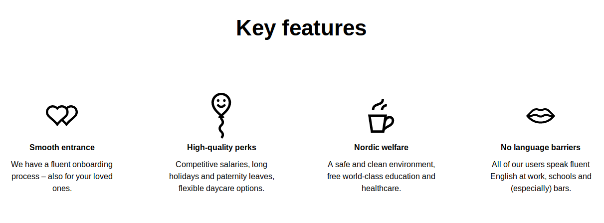
For example, “High-quality perks” has a smiling balloon, while “Nordic welfare” has a coffee mug. Those could be “a smiling balloon” and “a coffee mug with warm steam coming off the top”!
You can read more about alt texts and how to write them.
Some of the links and buttons on the page lack a focus outline.
For reference, interactable elements on the web have different (pseudo) states. One commonly designed around is “hover”, when the user mouses over an element. Those states typically change the background, border, or outline.
One state that often goes missing is “focus”. Focus on a page often moves around with the keyboard Tab key. Focus can also be moved programmatically, or with other interfaces than a keyboard. The purpose of focus is to indicate what is the current element that the user can operate. For many users, like those who navigate by keyboard, focus is extremely important to be able to locate where they are on a page, and discover which elements are operable.
Below is an example of the outlines on this blog.
Browsers provide default focus outlines. Even those are not always accessible, but are better than nothing. Yet, quite often, focus is hidden altogether! This is sometimes the result of a stakeholder or implementer having a distaste for when an outline appears for users with a mouse or touch pointer. Other times, it ends up as a blanket “reset” in CSS.
The fact of the matter is, that usurping a browser default without an alternative can actively exclude people.
On the site, the main rectangular links hide the focus outline altogether. Below is the source for those links, with outline: 0 as the default rule. With a pointer device, not only do the buttons get a coloured background, but they also get a ripple effect, one I know takes a while to implement in the browser. I feel frustrated, because it is a stark contrast to skipping basic outlines for people who rely on the keyboard.
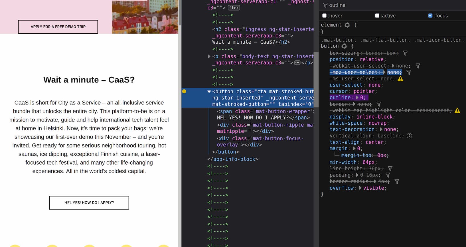
Other elements, like the list of reasons to live in Helsinki, and the list of sponsors preserve the browser default.
You can learn more about focus styles on the Web Content Accessibility Guidelines. There is also a post by Hidde de Vries on Mozilla Hacks about focus.
The video is one of the main content of the page (and the campaign).
There is a button to open a modal for the video at the top of the site. It is styled as a “Play” icon, a triangle in a circle, pointing to the right.

While it visually looks like a button, this control is only marked up as a generic container (div and svg). As such, it does not expose any specific role or accessible name to Assistive Technologies.
This is a problem for two reasons:
- It is not discoverable (or, perceivable), for many Assistive Technologies users, whose ATs rely on reading the markup to find functionality
- It is also not operable; a
divwill not receive focus, and will not open the modal with the Enter or Space keys.
In practice, this means that only a specific subset of users can open the modal.
A fix would be to introduce a button, and attach the click event handler to that button, instead of a div or the svg. The button would also need an accessible name, either through its content, or an aria-label.
<button
  aria-label="Open video modal"
  _ngcontent-serverapp-c2=""
  class="play-button"
>
  <svg
    aria-hidden="true"
    focusable="false"
    _ngcontent-serverApp-c2=""
    fill="none"
    height="64"
    viewBox="0 0 64 64"
    width="64"
    xmlns="http://www.w3.org/2000/svg"
  >
    <!-- Content skipped for brevity -->
  </svg>
</button>
Sara Soueidan has written at length on accessible icon buttons. Her post goes into the different considerations and possible solutions.
The modal that pops up for the video does not trap focus. Focus trapping is the pattern of constraining focus within the modal’s interactable elements. This helps users that rely on keyboard to not end up on content hidden “behind” the modal, or off screen. Similar constraints can apply to what parts of the document get exposed to Assistive Technologies.
Moreover, while the modal can be exited with the Esc key, the X button to close the modal is not marked up as a button, similar to the notes above.
Modals are a contentious issue in front-end. An option, in this case, might be to skip it altogether, and include the video inline. Doing so might make it more discoverable as well. Scott O’Hara has notes on modal accessibility, that I really like.
The colours in the application page are white text on dark turquoise background (#fff on #00d7a7). This has a low color contrast of 1.86. A low color contrast can be hard to read for many people. The solution would be to use a darker background. Sometimes, this can be caused by the need to use brand colours. Other parts of the site combine them well, so using one of those combinations is an alternative.
The HTML heading elements (h1, h2, h3 etc.) are meant to provide an outline for the document, almost like a table of contents.
With that in mind, h1 should be at the top-level, with sub-sections being h2 and so on. What should not happen, is jumping from h1 to, say, h3, without any intermediate h2. This can happen oftentimes when only the visual aspect of the headings is considered, but not the intermediate markup.
The reason for this is that certain ATs, like Screen Readers, can list the headings in a document. If they are well structured, they can aid the user in navigating the site. If they are badly structured, they can confuse or be useless.
For example, this part of the page at the start has an h5, and then an h1:
<div _ngcontent-serverapp-c2="" class="container">
  <h5 _ngcontent-serverapp-c2="" class="ingress ng-star-inserted">
    Helsinki is calling for demo users
  </h5>
  <div _ngcontent-serverapp-c2="" class="top-pattern"></div>
  <h1 _ngcontent-serverapp-c2="" class="heading ng-star-inserted">
    Welcome to the World’s First City as a Service
  </h1>
  <div _ngcontent-serverapp-c2="" class="bottom-pattern"></div>
  <p _ngcontent-serverapp-c2="" class="body-text ng-star-inserted">
    What is the most tech-savvy city on this planet? No idea, but Helsinki just
    became the world’s first City as a Service (CaaS). Apply for a free demo and
    enjoy an unforgettable trip to Helsinki.
  </p>
  <!-- The rest is omitted -->
</div>
Which could instead be:
<div _ngcontent-serverapp-c2="" class="container">
  <p _ngcontent-serverapp-c2="" class="ingress ng-star-inserted">
    Helsinki is calling for demo users
  </p>
  <div _ngcontent-serverapp-c2="" class="top-pattern"></div>
  <h1 _ngcontent-serverapp-c2="" class="heading ng-star-inserted">
    Welcome to the World’s First City as a Service
  </h1>
  <div _ngcontent-serverapp-c2="" class="bottom-pattern"></div>
  <p _ngcontent-serverapp-c2="" class="body-text ng-star-inserted">
    What is the most tech-savvy city on this planet? No idea, but Helsinki just
    became the world’s first City as a Service (CaaS). Apply for a free demo and
    enjoy an unforgettable trip to Helsinki.
  </p>
  <!-- The rest is omitted -->
</div>(I left the carousel last, because it had a few issues, and I think they are mostly combinations of those described above. I include these notes here because I believe I have seen the carousel in other City of Helsinki sites. Thus, there might be more systemic problems and solutions to it. Let me know if this assumption is wrong though!)
Similar to the button for the video modal, the carousel is not operable by keyboard, or exposed as interactable.
The carousel has left and right arrows, as well as “bullets” that one can click on with a mouse, to operate the carousel.
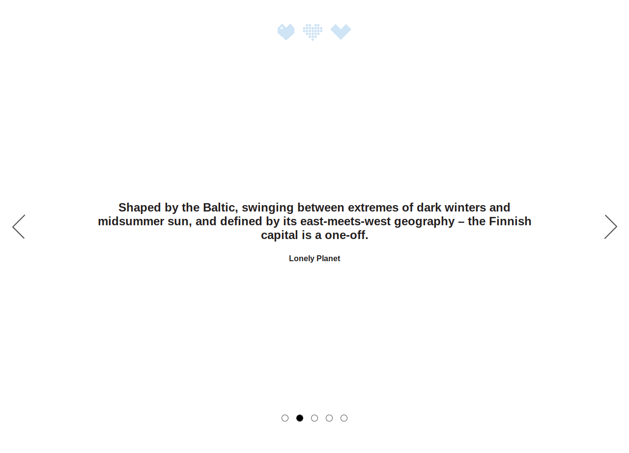
These controls, however, are only marked up as generic containers (divs). Those do not expose any specific role or accessible name to Assistive Technologies. Moreover, they cannot be operated by a keyboard because of that. The carousel can also be operated with the arrow (left/right) keys on a keyboard, but it is unclear to me how someone would discover that. In practice, this means that only sighted users with a pointer device (mouse, touch, pen etc.) can operate the carousel.
We will split the issues between the arrow and the bullet list operation.
The arrows
The issues with the arrows are similar to the notes for buttons above; they are not operable or perceivable.
<a class="carousel-control-next ng-star-inserted" role="button">
  <span aria-hidden="true" class="carousel-control-next-icon"></span>
  <span class="sr-only">Next</span>
</a>
In this case, it is not that they are marked up as a div. Rather, they are marked up as an anchor (a), with role="button". The role attribute is typically used to change the, well, role of the element that will get announced to Assistive Technologies. It is important to note, that setting the role does not really change the functionality by itself. Rather, it is a promise that this element will act like a button.
This promise clashes with using it on an anchor tag. An anchor tag is not operable if the href attribute is missing (it is meant for links, after all). Thus, while the element promises to be a button, it cannot be perceived as such (and thus, focused by keyboard etc.). If someone were to somehow focus on it, I believe that the Enter key would work, but I could not get that in my testing.
An interesting part of the arrows is that they have a label as text, and use an .sr-only class.
Typically, an .sr-only (“screen reader only”) class is a technique to hide an element visually, but keep it accessible in the tree that gets exposed to Assistive Technologies. Another common name for this class is .visually-hidden. This technique usually involves a combination of positioning and clipping. The A11y Project has some information on visually hidden, and Scott O’Hara has written about hiding content as well.
Visually hidden content is often used as a technique to provide accessible labels to buttons and icons. Its benefit over, say, aria-label is that it can get auto-translated by tools like Google Translate, and that it has a more prominent space in the DOM,which can aid maintenance. It is also a way to migrate components to be more accessible, which I believe (and might well be wrong!) is what happens here.
The .sr-only class on these arrows, however, sets display: none;. With that declaration, the content of the arrows is hidden both visually and from Assistive Technologies.
We can verify this directly in a Browser dev tools, for example Chrome accessibility pane or Firefox accessibility inspector. The arrow has a “button” role, and it does not have an accessible name.
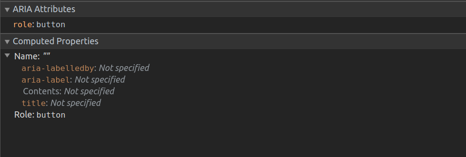
One solution would be to amend the .sr-only class to one of the declarations in the references above. It would probably not break anything visually, since content was hidden before as well, but it might require re-evaluating other components, or coming up with a migration strategy.
Bullets
The bullets themselves are list items (li), so while they have some more information, they still are not exposed as interactable.
<ol class="carousel-indicators ng-star-inserted">
  <li id="ngb-slide-10" class="ng-star-inserted active"></li>
  <li id="ngb-slide-11" class="ng-star-inserted"></li>
  <li id="ngb-slide-12" class="ng-star-inserted"></li>
  <li id="ngb-slide-13" class="ng-star-inserted"></li>
  <li id="ngb-slide-14" class="ng-star-inserted"></li>
</ol>
One step might be to change the markup, and add accessible labels to the controls. Note that there are different ways to do this, and that aria- attributes are often a band-aid on more systemic issues (see Sara Soueidan’s article on icon buttons). In this case, we could opt to add buttons inside the list items.
<ol class="carousel-indicators ng-star-inserted" aria-label="Carousel controls">
  <li id="ngb-slide-10" class="ng-star-inserted active"
    ><button aria-label="Jump to slide 1"></button
  ></li>
  <li id="ngb-slide-11" class="ng-star-inserted active"
    ><button aria-label="Jump to slide 2"></button
  ></li>
  <li id="ngb-slide-12" class="ng-star-inserted active"
    ><button aria-label="Jump to slide 3"></button
  ></li>
  <li id="ngb-slide-13" class="ng-star-inserted active"
    ><button aria-label="Jump to slide 4"></button
  ></li>
  <li id="ngb-slide-14" class="ng-star-inserted active"
    ><button aria-label="Jump to slide 5"></button
  ></li>
</ol>
On the topic of a carousel, it might be desirable to offer a pause/start button, to give control to the user. An alternative design might be to skip the carousel altogether, and inline the quotes on the page. Maybe those would work just as well!
We have covered a lot of ground! In an initial version of this writeup, I wanted to take the proposals above, and put together a version of the website with them.
I realised that doing so would not achieve much. I imagine that much of the content is not “hard coded”, but rather comes in from a Content Management System (CMS), as noted previously. If components are being re-used or shared between other properties, it is also likely that the solutions to those would have to be systematic, and adding band-aids on top of them for a specific site would likely lead to it deteriorating further in the future.
Thus, I would take this opportunity to go the other way, and call back to the note at the start.
If you are reading this and you have a role that can affect the page, consider this post an invitation for dialogue, or a call to action. The concrete issues are solvable. Ensuring that future efforts are also accessible is a larger undertaking, that I invite you to participate in.
If you are a designer or developer that is interested in making the web accessible for everyone, I hope this post can give you a good reference for any future work! If part of this post is a sampler, consider the links and references as potential for you to dive into the subject. If you found this useful, I would love to hear from you.
Many thanks to the Spice program, by my employer, Futurice. It allows me to allocate my own free time and professional expertise for causes that help society, while being partially compensated for it. Writing this post would have been impossible without this privilege! These are the kind of initiatives that I love in this country.
Having said the above, bear in mind that the opinions shared here are my own, and not those of my employer. I outlined my reasons in motivation.
If you have thoughts on this post, you can reach out on Twitter. I realise that Twitter is not the best place for nuance, so you can use my other contact info, if those offer a better medium.
If you have read this far, thank you for your time and attention :)
